Is Mobile-First Development & Design a Good Thing?
The short answer is an unequivocal “yes.” But the longer answer — the right answer — is a bit more complicated than that.
The trend to mobile devices for internet access is proceeding unabated. By many measures it is accelerating. And there are those — us included — who think that the current trend to Edge datacenter nodes, the eventual roll-out of 5G cellular networks, and the advent of low-earth orbit broadband access (yes, we’re talking about Starlink) will only increase the amount of traffic on mobile devices.
But no one is “making” the shift to mobile devices happen. It’s important to remember that it was the advancement of mobile device technology that allowed us to discover how, when, and where actual customers — real internet-using people — preferred to access the web.
So, when it comes to discussing your mobile strategy, it is the actual behavior of actual people that should determine how we apply our IT resources and inform all of our design decisions.
What You Measure Matters
There are tons of applications and tools that professional tech people and marketers use to produce website analytics. But by far the most ubiquitous is Google Analytics. We are not playing favorites here — and we kind of hate having to give Google any more attention than they already get — but we will speak in the context of Google Analytics for the balance of this article. But we encourage everyone to collect data, map, and measure using the application of their choice.
That said, when you are looking at your analytics results, there are some things that you should pay attention to.
A Comment on Mobile Device Discovery
The first is that you should naturally notice the percentage of visitors that find you on mobile devices — phones and tablets — versus desktop/laptop computers. It may not surprise you that the trend is strongly in favor of mobile devices. It is not uncommon for a website — especially eCommerce merchants — to see between 60% and 80% of all their traffic coming from phones, few percentage points coming from tablets, and the balance being on regular computers.
Many website admins and marketing pros see that number and then focus ONLY on mobile — often losing sight of the bigger picture. You need to look at two additional stats:
- The conversion rate per device type.
- The cross-device usage.
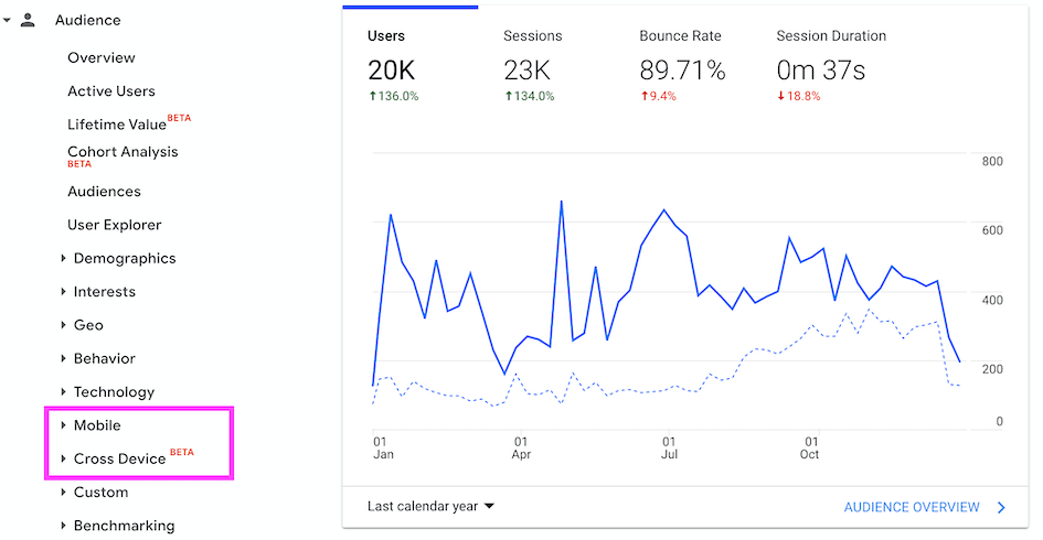
Both of these reports are a part of the normal Google Analytics dashboard, but you may need to enable the cross-device stat (turn it on by granting permission from within the Google Analytics dashboard). When you are logged in as an administrator for your site in Google Analytics, look for these areas in the left menu of your dashboard. When you try to access them Google will prompt you to authorize the collection of that data if you are not doing so now.
Once you do all of that and have 2 to 3 months’ worth of data collected the information will start to become more useful. You may notice — as many do — that even though the total traffic is higher on phones, desktop/laptop computers have a higher conversion rate. You may also notice that a meaningful percentage of your users are visiting your site on more than one device — they go from phone to computer and back again.
What Is Mobile Device Discovery Really?
The reason that this is simple. People are accustomed to using their phones as “discovery devices.” They will browse and search on their phones while doing lots of other things. But when they want to really dig in … see bigger images … compare and contrast with competing options … well, that is often an easier and better experience for many people on a full-size screen. The more products, options, and competitors you have the more likely they will be seeing you on multiple devices. It is also statistically more true if you are primarily marketing to consumers (B2C) as opposed to businesses (B2B).
Even some very large and successful businesses have lost their way by adopting a “mobile-first” development and design philosophy when they do so to the exclusion of understanding the real human behavior of their customers. Addressing this confusion is why Google put this additional information in their Analytics. But still, many do not understand this distinction.
The Answer to the Mobile-First Question
The answer is likely more complex than the popular tech and marketing gurus give it credit for. Often the best answers that take a bit of hard work do not get the most attention.
For many businesses, mobile is and will remain the primary focus of their website and application design and development work. For others it will remain the desktop. There will be other businesses for whom a custom app is a primary solution. But for the vast majority of businesses there will be a balance of needs across all three commensurate with the journey real customers take through a company’s internet assets.
The point is that each business is unique and that means the preferred behavior of the target audiences of each business should determine where IT resources are deployed. If your answer is “mobile-first” because that’s what everyone is saying at the moment, it’s time to go back to the analytics and find out what your customers want to do.
If you need help with your website or application, have questions, or are unsure about the right questions to ask just give us a call. We’re always happy to help.